SKOSHI ICE CREAM BRAND
Web design • Responsive logos • Packaging
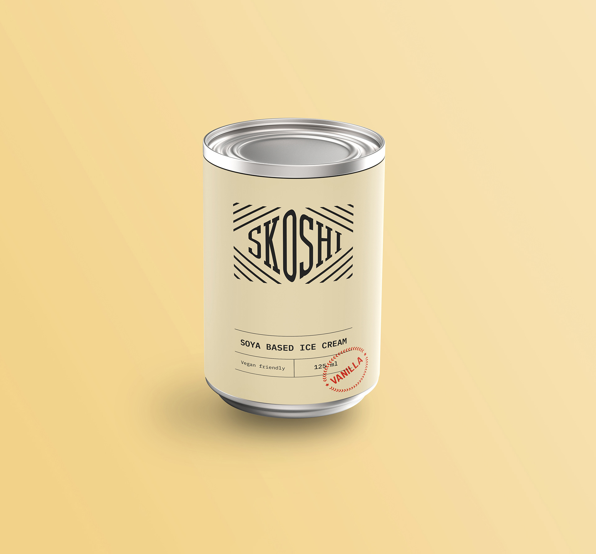
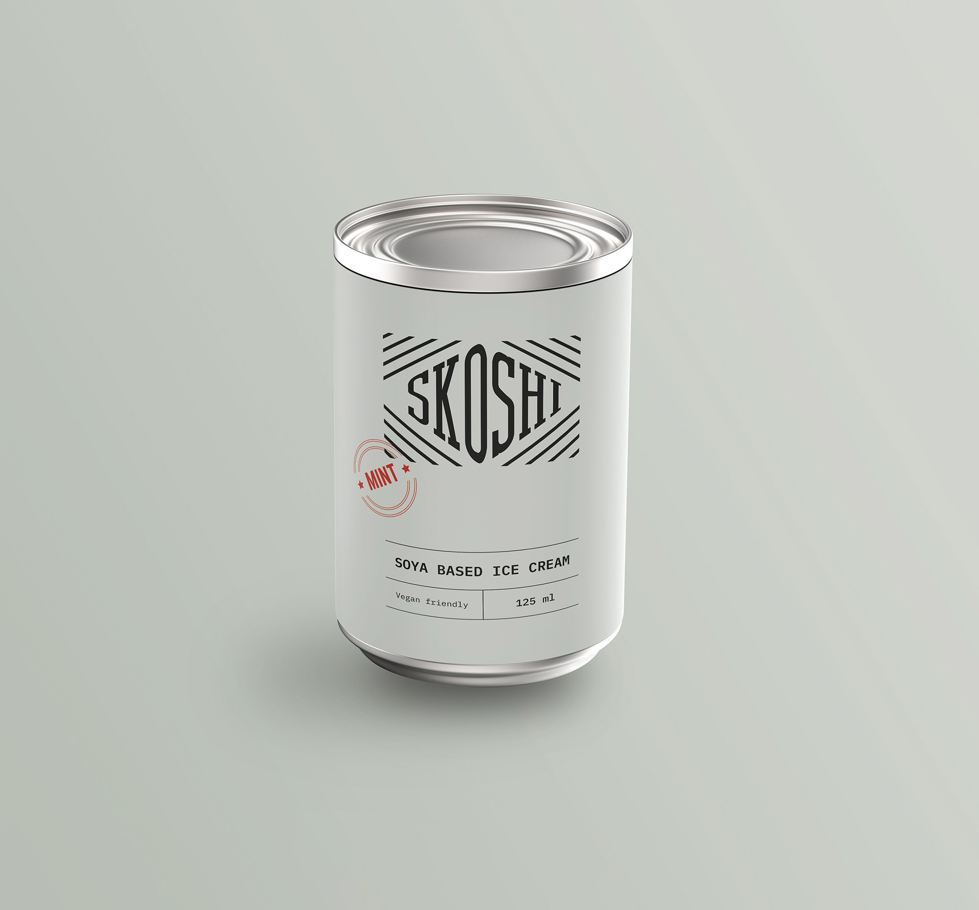
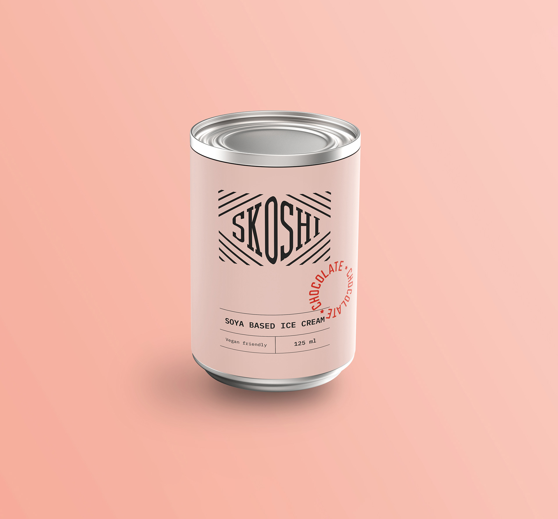
The brief was to craft a new brand identity for a new vegan ice cream including. The concept builds on an origin story of American GI's who were already experimenting with soya based ice cream in 1940's Japan 1940's Japan, where rationing led to a little creativity.
Project Overview
Developing a brand identity for a new ice cream brand was a concept project. The goals of the new company were to stand out from the other health focused ice creams on the shelf. The brief was to craft an identity including a backstory, accompanying name and responsive logos, a desktop website and packaging materials.
My Contributions
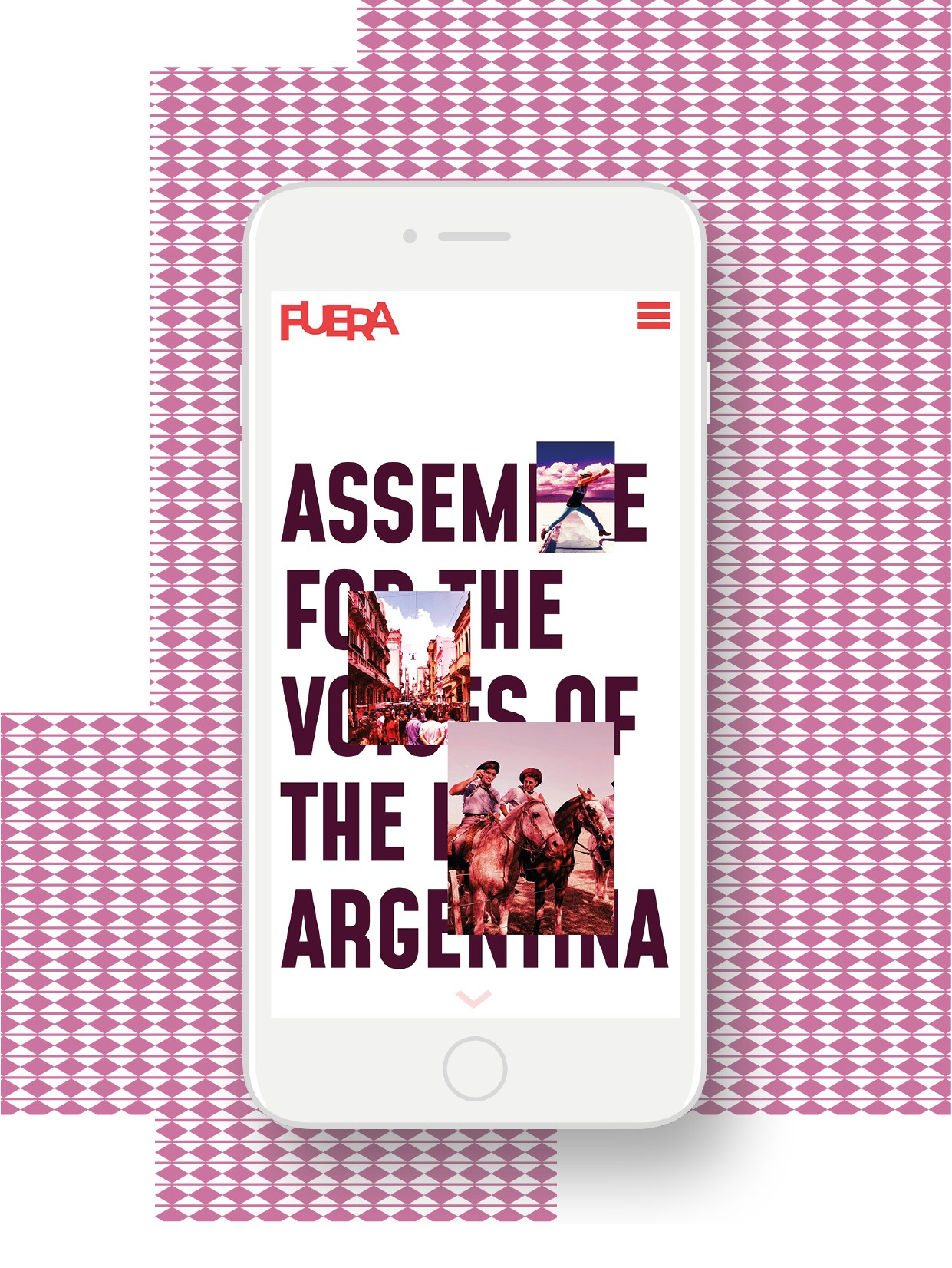
As a Graphic Designer, I started with research into the target audience and history of ice cream in parallel. I came across a story about making ice cream using rations by American GIs in 1940s Japan, and turned it into the quirky, vintage-feeling brand that is Skoshi. After crafting the three responsive logos, I designed the packaging with a nod to old ration cards. This also translates to the simple line based design of the website landing page, which uses a typewriter inspired font in combination with stamps to present the user with buying options and some additional information. I used Photoshop to create the vintage photography and duo-tone effects, Illustrator to craft the logo and stamps, InDesign for the packaging layouts, and Figma for the web page.
