COUP CINEMA IDENTITY
Brand identity • Logo design • Print
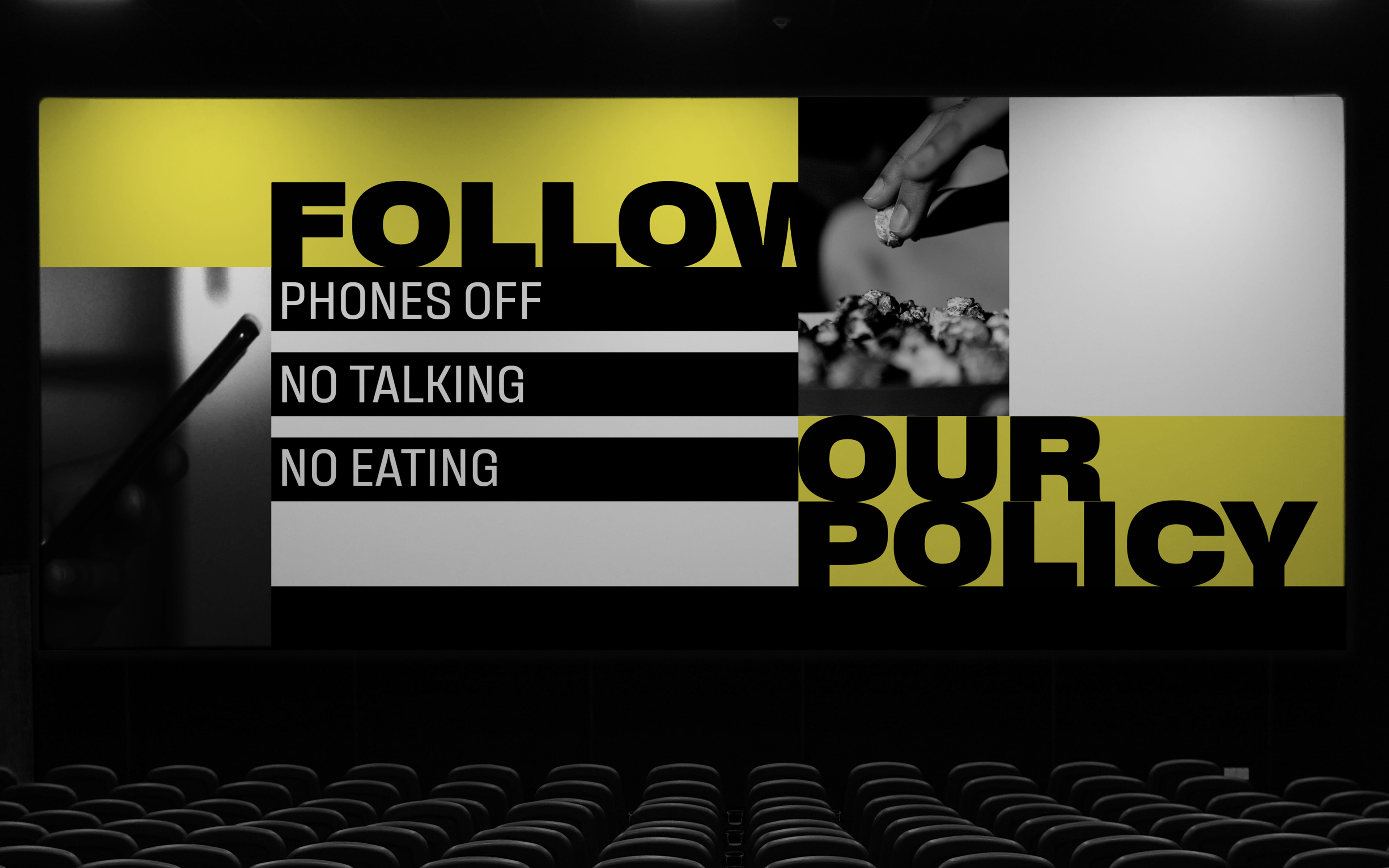
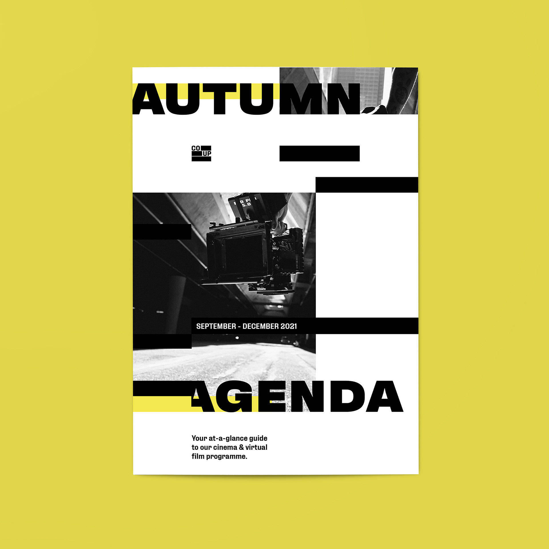
The brief was to craft a new brand identity for an independent movie theatre in Chicago. The city was the literary capital of 1920's America, and one magazine published whatever they wanted, no matter the public tastes. The concept was inspired by the censoring of the 'Little Review' magazine.

Project Overview
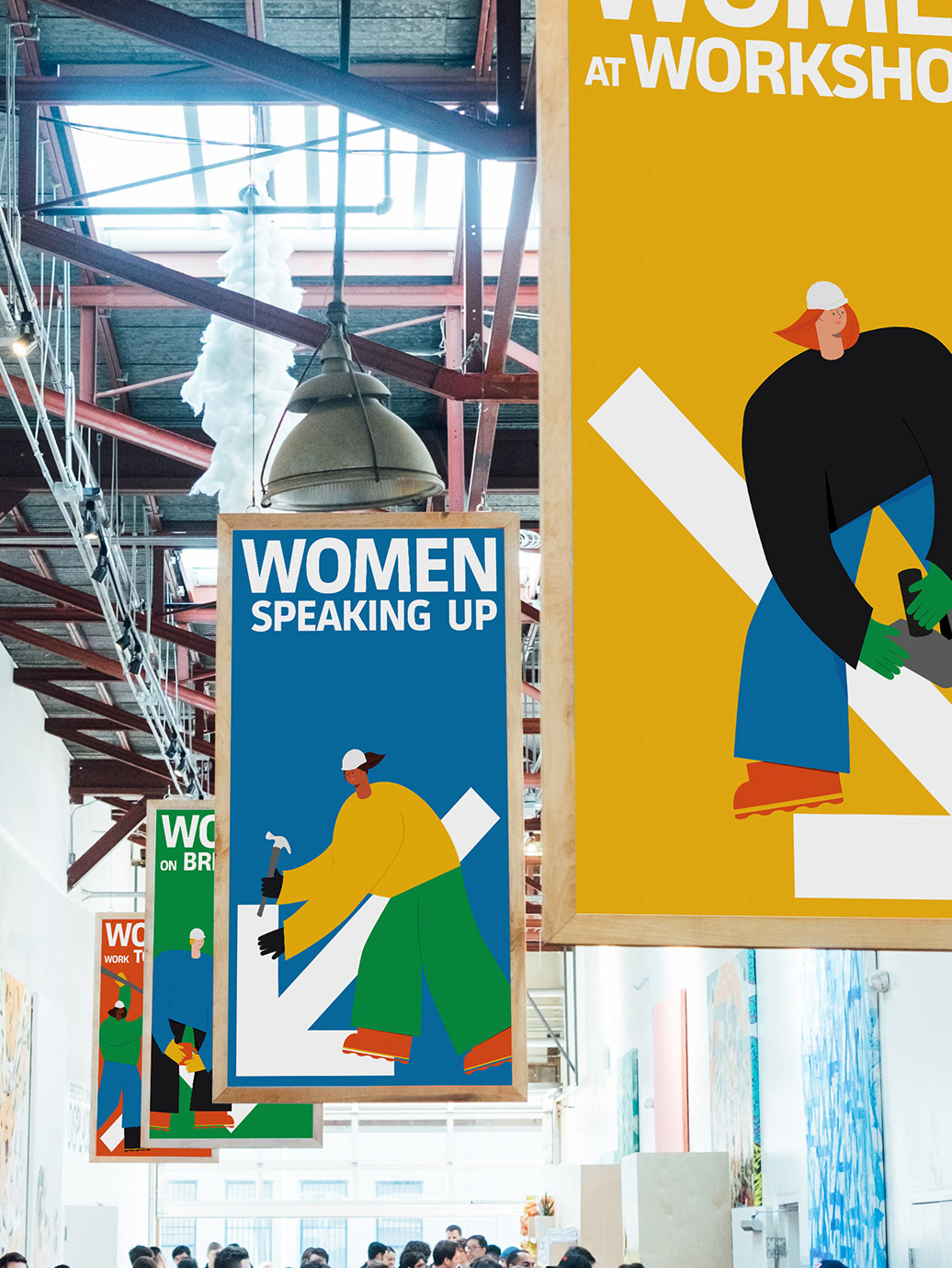
Developing a brand identity for a cinema start-up was a concept project. The goals of the new company were to stand out from the other health focused ice creams on the shelf. The brief was to craft an identity including a brand name, logo, poster wall and theatre marketing materials.
My Contributions
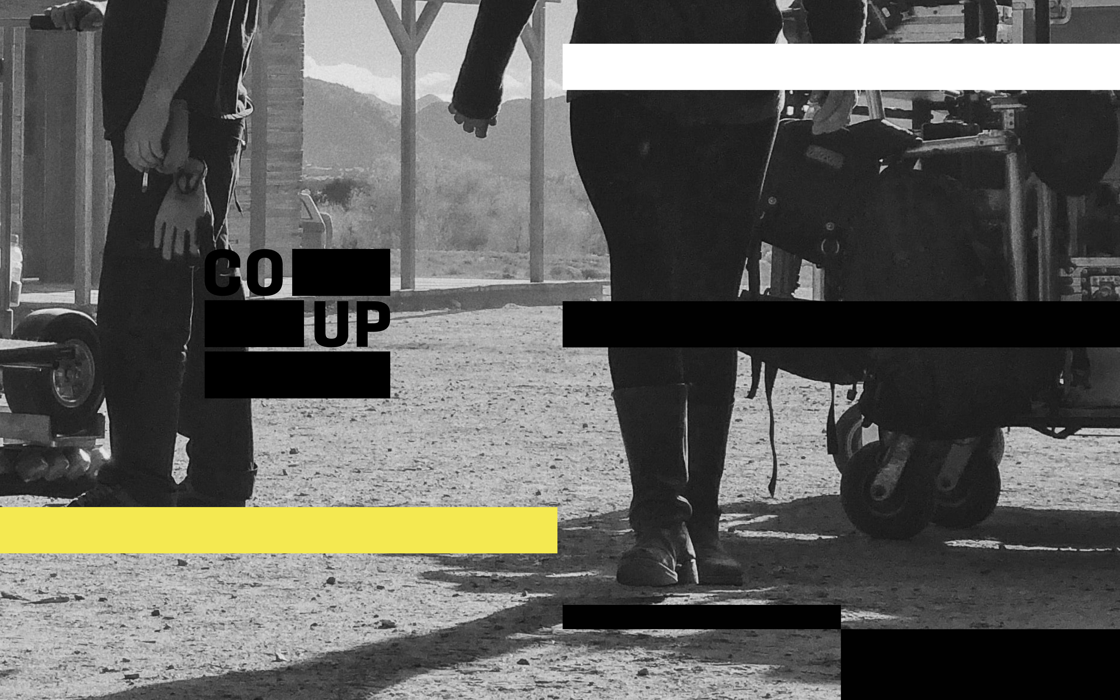
As a Graphic Designer, I started with research into the target audience and history of Chicago. I came across a story about the censorship of a magazine called the 'Little Review' from a time when Chicago was a creative force in the literary landscape. After coming up with a the name Coup to reflect the rebellious nature of the independent movie theatre, I designed the logo with a nod to censorship bars from redacted documents. This translated into the black bars that you see throughout the brand identity. I used Illustrator to craft the logo, InDesign for the design layouts, and Photoshop to create the gif and mockups.
